back up, back up.
I meant to say “worth it”
Why are websites important?
- Your owned space. You own this site. You are in charge of what’s there, not the owners of Facebook, IG, Twitter, etc.
- Guide your community. This is where you can help your community of supporters with downloadable videos and guides, walk them through your common services, sell your products, and instruct people to get in touch with you.
- Demonstrate your expertise. This is like the modern portfolio. Share photos and videos of past jobs, share testimonials from happy customers, create a store of your products, and prove that you and your small business are legit.
- Make sales. All you need is a Paypal account to start making money from your website. Another stream of income, anyone?
- Expected of you. It’s not cute and unique anymore. A website is an absolute expectation in modern business best practices.

Slow this down a sec…I’ve got a few questions.
Does your website need to be fancy?
No. Some of the best websites are simple and easy to navigate. You can even opt for a “landing-page” site, with is one scrollable page with all your info clearly organized.
How much should a good site cost?
Sites can cost anywhere from $10 to thousands of dollars. It all depends on your needs and purpose.
First investment: purchase your domain name. You can do this through godaddy,com or sometimes through the platform you’re building your site on.
Second investment: platform. You can use drag-and-drop platforms like Wix, Weebly, WordPress, Showit, or SquareSpace to start from a template, or you can code and customize your own site. All these platforms have free options if you are looking for a simple layout with minimal storage needs, or you will incur a yearly fee if you want more data options or online shopping/membership site services. You can also build it yourself to save $, but here you will invest more time. OR you can invest your money to hire someone to do the build for you.
What pages do I absolutely need?
You absolutely need a clear, concise homepage. Keep your messaging simple and your navigation options clear to the needs of your audience. You also need a contact page so your visitors can quickly get in touch with you. An “About” page is crucial to getting your audience to know you and the story behind your business to build that all-important know-like-trust factor. Other page options are services pages, portfolio of work, testimonials, case studies, blog, online store, pricing, etc. YOU are in charge of how simple or detailed your site can be.
Where do I start?
I cannot testify enough to the power of the book Building a Storybrand by Donald Miller. The whole book helps you identify your messaging for your business in a way that is clear and appealing to potential customers, and then later in the book there are chapters that go into detail about laying out a website to maximize your Storybrand marketing potential. It’s awesome. Go buy it here.
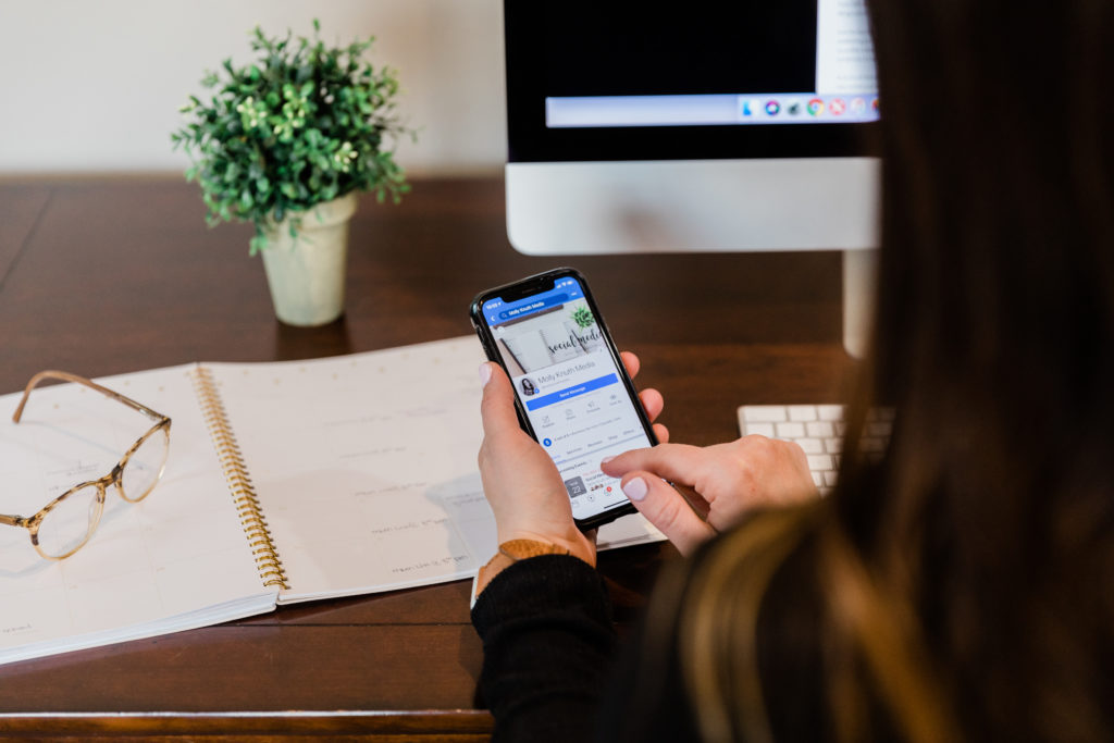
Next, if you want it broken down for small town small businesses, head to the “Video” library on Molly Knuth Media on Facebook for my advice on building your website.
Copy (aka, the writing on your site)
Keep your text brief but clear. People don’t want to read a novel when they land on your site, but they do want to get to know you and what you do. So break your digital copy into short chunks, bulleted lists, column headers, etc. to break up those long passages of text and draw your readers’ eyes to the important material.
Quality images
Do you need to hire a photographer right out of the gate to start your site. No. iPhones and modern smartphones take great pictures to use in smaller photos throughout your site. For those larger, eye-catching images, though you may need a professional photo to ensure that it is high-quality and sharp. Another option is to find stock photos from sites like AdobeStock or Pexels to help find HD quality photos that are consistent with you and your industry.
Branding
Keep the colors and fonts limited and in line with your overall branding. The more you vary your fonts, the less cohesive your site will look and the better chance they won’t show up correctly on a variety of devices that your audience will be utilizing. Keeping your brand colors in line will also create common unity from your other marketing materials into your digital marketing platforms.
Responsive
Most modern sites are automatically responsive, meaning the site adjusts to sizing changes from desktop to tablet to smartphone, trimming your columns as needed and scaling your photos so they aren’t cut off or distorted. But if your site hasn’t been updated in awhile, you may need to check this. You don’t want your logo cut in two or your phone number missing from the header image.

How can you get help?
Head over to Molly Knuth Media or IGTV this month for weekly tutorials about building a website that works for your small town small business! We’ll be covering all the things from basics like what pages you need to include on your site to complex like SEO best practices. It’s gonna be a good one!

Be the first to comment